Overview:
This project unfolded as a comprehensive website design and development endeavor, with a predominant focus on graphic design, brand coloring, image optimization, UX design, and the integration of responsive design elements.
Project Goals:
Our mission was to encapsulate the essence of a Pinterest-inspired aesthetic, infusing the website with a cozy yet inspiring ambiance. Central to the project was the goal of redefining Natalka’s brand colors and online presence. Simultaneously, we aimed to maintain numerous photo galleries and ensure a user-friendly experience, particularly catering to beginners with easy-to-use editing capabilities.
Key Points:
Several pivotal tasks defined the trajectory of this project. The commitment to a full responsive design ensured that the website seamlessly adapted to various devices. The user experience (UX) design was meticulously crafted to evoke a sense of coziness and inspiration. Prioritizing optimized page loading speeds enhanced the overall performance and accessibility of the website.
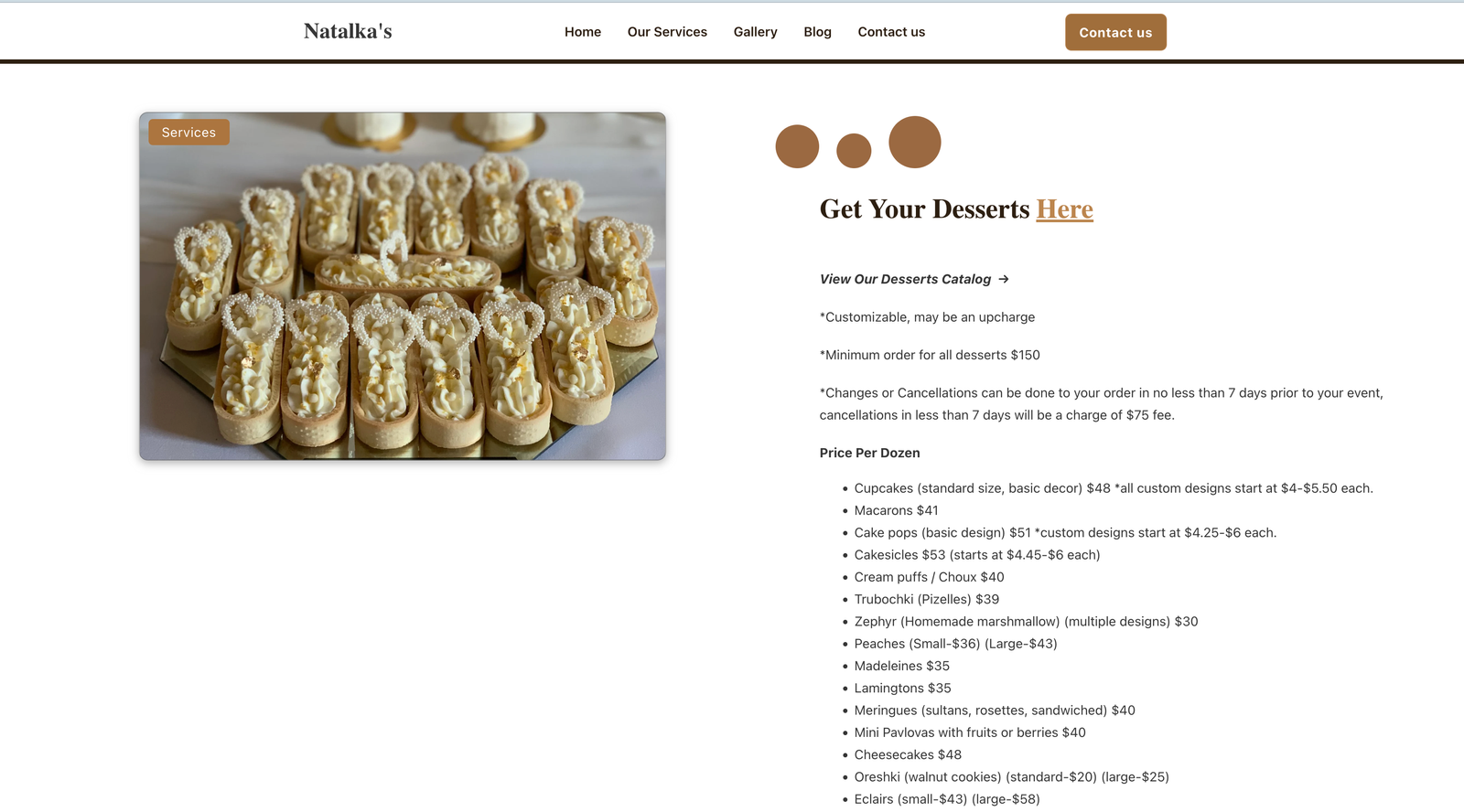
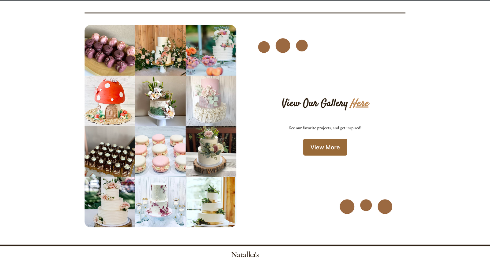
The incorporation of a fully dynamic blogging system paved the way for effortless integration of future posts, adding a layer of dynamism to Natalka’s online presence. The inclusion of photo galleries served as visual narratives, enhancing the overall appeal and storytelling aspect of the website. Crucially, an exceptionally user-friendly editing system was implemented, designed to cater to beginners and facilitate future edits with ease.
Results:
The culmination of these efforts resulted in a spectacular example of a personal/hobbyist website. The website’s aesthetic resonates with a sweet simplicity, encapsulating everything needed for an enriching online experience. Not only is it visually appealing, but it also stands as a testament to functionality. The ease with which edits can be made ensures the website’s adaptability for both present and foreseeable future needs.
Crafting a Pinterest-Inspired Aesthetic:
The journey toward a Pinterest-inspired aesthetic was marked by an intentional blend of design elements that exuded both coziness and inspiration. Graphic design played a pivotal role in capturing the visual essence, while the thoughtful choice of brand coloring added a cohesive and recognizable touch to Natalka’s online identity. Each element, from images to layout, was optimized to seamlessly align with the desired aesthetic, resulting in a harmonious digital space.
Redefining Brand Colors and Online Presence:
Central to the project was the task of redefining Natalka’s brand colors and online presence. This involved a meticulous exploration of color palettes and design choices that not only reflected Natalka’s personal style but also resonated with the desired cozy and inspiring feel. The revamped brand colors became a visual language that communicated the essence of Natalka’s identity, creating a cohesive and memorable online brand presence.
Maintaining Photo Galleries and Beginner-Friendly Editing:
A key challenge was to balance the visual richness of numerous photo galleries with the need for an extremely user-friendly editing system. The integration of photo galleries added a dynamic and storytelling dimension to the website, allowing visitors to immerse themselves in Natalka’s visual narratives. Simultaneously, the emphasis on an easy-to-use editing system ensured that even beginners could navigate and make edits effortlessly, empowering Natalka to control her digital space with ease.
User-Friendly Experience:
The success of the project lies in its commitment to providing a user-friendly experience. From the intuitive UX design to the optimized page loading speeds, every aspect was crafted with the end-user in mind. The website stands as an inviting and accessible space, inviting visitors to explore and engage without any technological barriers.
Adapting to the Future:
One of the project’s lessons was its forward-thinking approach. The fully dynamic blogging system not only caters to present content needs but also positions the website for future growth. The user-friendly editing system ensures that Natalka can effortlessly make updates and additions as her digital presence evolves. The website, in its simplicity and functionality, is poised to adapt seamlessly to the dynamic landscape of online expression.
Our Conclusion:
In conclusion, this website design and development project covered the transformative power of creative vision and meticulous execution. From the initial goals of a Pinterest-inspired aesthetic to the realization of a visually appealing, user-friendly, and adaptable digital space, each step in the journey reflects a commitment to excellence. Natalka’s personal/hobbyist website stands not only as a reflection of her unique identity but also as a testament to the harmonious interplay of design, functionality, and user-centricity. As we navigate the digital landscape, this project serves as a shining example of how thoughtful web design can elevate personal expression in the online realm.
Are you Interested in checking out Natalkas Cakery?